

May 21, 2015
Real Estate Development Map
Here is another example of a map I designed this year. It's for a high-end development near a golf course in Florida.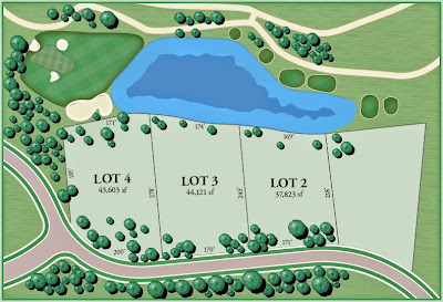
May 20, 2015
Animated Flip Board Display Example
This is an animated GIF I created in Illustrator and Photoshop. It has over 150 frames, each hand-crafted with care in Illustrator, then assembled into the GIF in Photoshop.
In case it doesn't view well directly on the blog, I put it on YouTube as well. To do that, I had to convert it to video format before uploading. You can view it here.
May 15, 2015
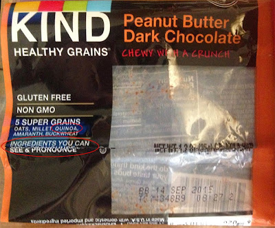
Quin-oh-ah?
Maybe I'm the only one who thinks the marketing text on this snack bar packaging design was funny. I added the red ovals to show what I'm referring to.

May 13, 2015
3-D Building Rendering

As part of a map re-design that I helped on recently, I rendered a digital illustration of an old building so that visitors could identify it. The result is shown to the left.
Drawings like these are both fun and challenging. This was done from a couple reference photographs, so making it look proper in three-dimensions takes some work, as I didn't have an aerial photograph to work from.
There are many advantages to drawing it as opposed to using a photograph directly. First, the ability to make the building show at the angle you want. It also allows you to match the style of the rest of the map. Finally, a photograph would look "cut out" and detached from the rest of the map (which is sometimes desirable, but not in this case).
Digital Pixel Resolution, or What is DPI?

Anything that is displayed digitally or in print has a resolution. This post will quickly explain what this means, and why it matters to you.
What you see on the screen you are reading this on is composed of tiny dots of color. The smaller they are, the crisper the image. The number of dots, or "pixels" across an inch (or other unit) is called the resolution. The same is true for anything that is digitally printed, which is common these days.

So what is a "good" resolution? The answer depends on how you are looking at it.
When printed, images should have a 300 DPI, or dots per inch. If an image has a resolution much lower than this, jagged edges will appear, and your marketing materials will not look professional.

When viewed on a screen in a browser, the standard is 72 DPI.
The images on the left have resolutions of 30, 72, and 300 DPI. Notice the difference?
This is an abbreviated version of a one-sheet informational flyer on image resolution that you can download as a PDF.
May 12, 2015
Marketing Flyer (Corporate One Sheet)
This post will talk a bit about my process for graphic design.
A few months ago, a very nice client of mine called to ask me to design a corporate one sheet. That was a new term to me - one I hadn't heard in my five years as a graphic designer. It's basically a one-page flyer.
So now I knew what I was supposed to design, and I had some photographs from her business to work with.
What happens next in the secret world of graphic design?
This is where the process can go all over the map. Some clients give me a rough idea of what they are looking for, and some leave it wide open. This client had made a rough composite that showed the headline and text they wanted, and had a sample background photo. But it needed a "design," which is why she came to me.
So since I wasn't starting from scratch, I selected a primary photograph, and started setting up a rough layout in Adobe Illustrator, the software I use for about 90% of my work. But I had to select an appropriate photograph, and make sure it was up to the job. I chose one, and did some cropping and level-adjusting in Photoshop.

Being for a trampoline business, I want to make the action in the picture easier to see and feel. Noticing that the picture had some less interesting areas, this led me to carving out curved areas for some of the text, which seemed appropriate for the motion of the activity being advertised. After some adjusting, a request for a smaller second photograph, and some revisions, the result is what you see on the left.
Post a comment and let me know what you think!
Where Did Aurelian Design Go? Nowhere!
It looks like I've failed to blog for about a year, so let me give a short update on your favorite graphic design freelancer. I've been busy with a wide variety of projects, from brochures, to posters and ads, and lots of maps, which are a personal favorite of mine.
And after five years in business, my graphic design projects are coming from, and going to, a much wider geographical area.
I've designed maps for sites and organizations in Florida, Virginia, and Indiana in the past few months. Many were for real estate developments. One was an HTML map that linked to service providers for defined regions across a state. And there was one for a small campus, with 3-D illustrations of some of the buildings. Still no subway map design projects, but I can dream.

Well, that wasn't so hard. Now I'll have to do a flurry of blog posts, highlighting a few special projects, followed by the obligatory year of missing posts.
Subscribe to:
Posts (Atom)